

Have you ever noticed that past market moves can give you clues about what might come next? Technical analysis is like a map of history, it shows familiar patterns just like the steady rhythm of a heartbeat.
In our post, we break down simple chart ideas and trend lines, making it easy to decide when to buy or sell. We use plain language to explain these signals, so reading price changes feels as natural as watching your monthly savings grow.
Get ready to explore insights that can guide you toward smarter moves in the financial market.
Fundamentals of Technical Analysis in Financial Markets
Technical analysis uses only past price and volume data to help us decide when to buy or sell. It’s a bit like relying on a well-worn map that shows where prices have been before. This approach uses simple chart ideas that many traders repeat over and over again to see market moves.
Think of it like watching a heartbeat. Traders follow a price action strategy, basically, a step-by-step method, to spot familiar patterns and shifts in the charts. By mixing in these core chart ideas, we get what’s called technical trend analysis. This approach highlights key turning points and trend lines, making it easier to spot when a market might change directions.
When assets are traded often, these basic chart signals tend to be reliable. But if an asset isn’t traded much, the signals might be a bit confusing. Still, following a clear price action strategy with these chart principles can help you find good moments to enter or exit a trade.
Now, no strategy can promise future success, but using a consistent technical trend analysis with a strong price action plan can make risk management easier. So, while each signal you see is useful, remember, none of them are a guaranteed roadmap to where prices will go next.
Chart Types and Trendline Drawing Techniques for Technical Analysis

Line charts are one of the easiest ways to follow a stock's journey. They simply connect the closing prices day by day, like drawing a line through a series of dots that each tell part of the price story.
Bar charts add a little more detail to the picture. Imagine a tiny vertical bar where the top marks the highest price of the day, the bottom shows the lowest, and small dashes on the sides pinpoint the opening and closing prices. It’s like getting a mini snapshot of the market's mood each day.
Candlestick charts, which came from Japan, bring even more clarity. They use a “body” to show the gap between the opening and closing prices, while the “wicks” indicate the day’s highs and lows. For example, a long body can suggest strong movement, with short wicks hinting that prices didn’t stray far from that central range.
Point and figure charts are a whole different ball game. They replace traditional numbers with simple Xs and Os, letting you focus purely on price changes without the distraction of time.
Trendlines are a key tool in this mix. By drawing lines through key swing highs or swing lows, you can spot trends and signals, like connecting several low points to reveal a support level that might hint at a coming reversal. For more tips on mastering these chart techniques, check out this guide: how to perform market analysis.
Indicator Functionality and Oscillator Usage in Technical Analysis
Indicators and oscillators are handy tools that help you decide when to buy or sell. They work like a friendly guide, pointing out potential turning points in the market. Take the Relative Strength Index (RSI), for example, it checks whether a market is swaying too high or dropping too low. When the RSI hits 70 or above, it’s a hint that the asset might be overbought. If it falls to 30 or under, it suggests the market might be oversold. Imagine looking at your chart and seeing an RSI of 75; that’s a cue to be cautious because a price pullback could be coming soon.
Another useful tool is the Moving Average Convergence Divergence (MACD). This tool zooms in on the market's momentum by comparing two moving averages. When the shorter moving average crosses over the longer one, it can signal a good time to buy. On the flip side, if it crosses the other way, it might be time to consider selling. Picture a line steadily climbing past its partner line, it’s like a gentle nudge saying an upward push could be on the horizon.
Relative strength analysis is another way to peek at performance. It compares an asset’s strength to major benchmarks like the S&P 500 or NASDAQ. This simple check shows if a stock or asset is outpacing the market or falling behind.
Keep in mind that oscillators work best when prices move within a certain range. In strong trends, these tools might send mixed or confusing signals. Traders often watch for something called oscillator divergence. This happens when the direction of the price and the oscillator don’t match up, a little sign that a reversal might be just around the corner.
Using these indicators and oscillators together adds another layer of insight to your trading plan. They can point out clearer moments to step in or step back, all while helping you manage overall risk.
Chart Patterns Recognition and Fibonacci Retracement Methods in Technical Analysis
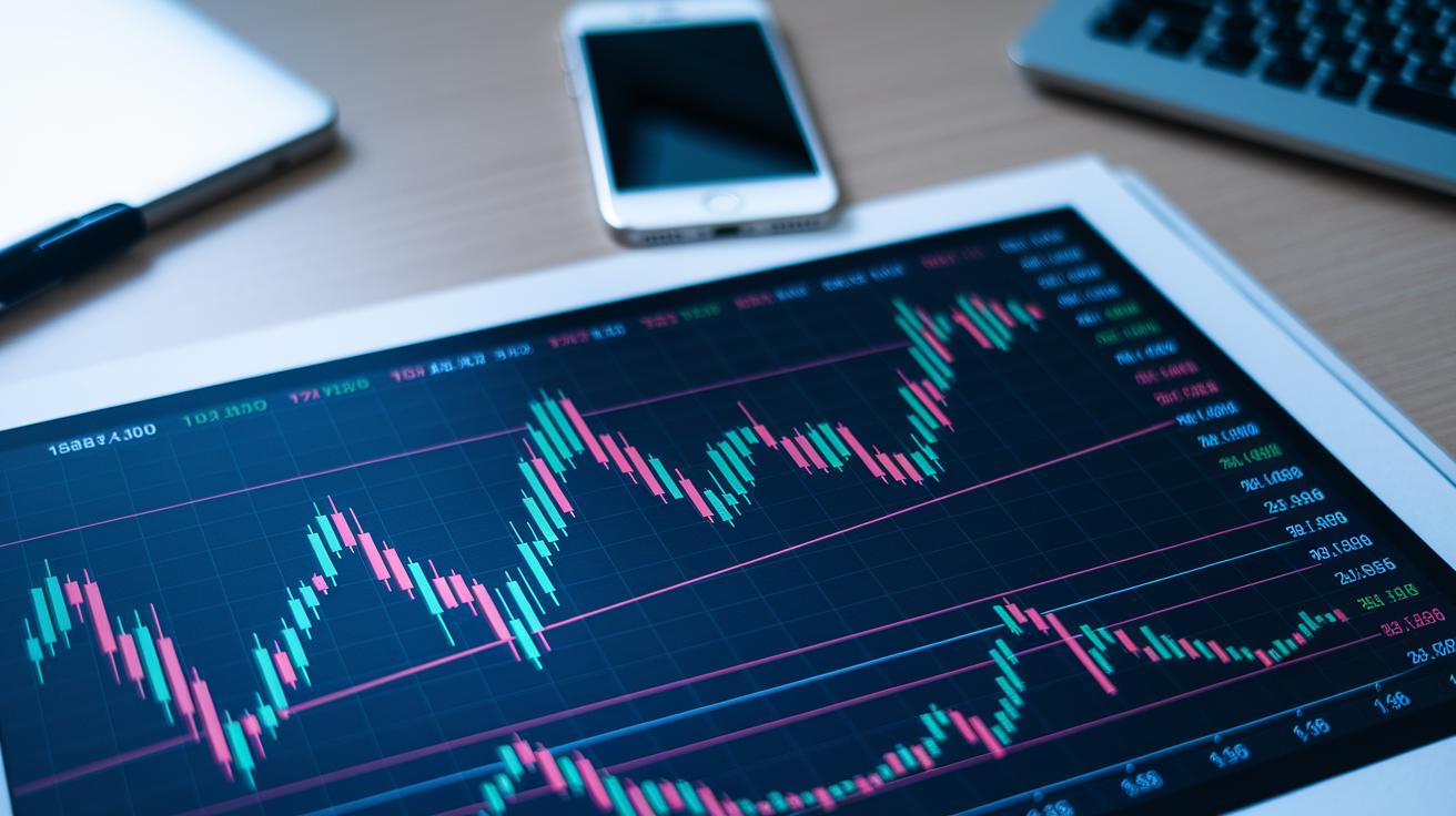
Chart patterns are like visual hints on a price chart. They help you notice when prices might turn around or keep on moving. For example, a head and shoulders pattern shows a price rise to a peak, then a drop to a smaller peak, and finally another rise that nearly matches the first peak before falling sharply. Other classic patterns like double tops and bottoms, triangles, flags, and wedges point to moments when the market may change its direction.
Candlestick patterns add another layer of insight. These patterns include signals such as bullish or bearish engulfing, hammers, shooting stars, and the rising three methods. A hammer, for example, might show that a falling market is losing strength, hinting that buyers may soon step in. Watching these candle shapes closely can really help you time your trades better.
Fibonacci retracement is also a useful tool. It works by drawing horizontal lines at 38.2%, 50%, and 61.8% of a previous price move – think of these as checkpoints. If a price drop stops at the 38.2% line, that level might serve as a steady base for prices to bounce back up.
Market geometry concepts, like 1:1 structures, also help spot recurring price ranges. These patterns can signal a good time to join a trend after a pullback.
- Learn to spot false breaks to avoid jumping in too early.
- Match clear patterns with retracement levels to decide on entry and exit points.
- Mix multiple signals together to build a stronger case for your trade decisions.
Putting these techniques together gives you a complete picture, so you can trade with more confidence and clarity.
Support and Resistance Level Strategies in Technical Analysis
Support zones are areas where the price has bounced off a low before, while resistance zones come from places where the price hit a high previously. These levels work like invisible walls. When the price breaks above a resistance level, that level might turn into support in the future, and the same goes for support levels breaking. Imagine a ball bouncing off the ground; that's how you can picture a support level in action.
Traders pay close attention to these zones to decide when to enter or exit a trade. They like to see extra clues before making a move. For example, if the price goes above a resistance level, traders might wait for a boost in trading volume or a clear candlestick closing above that level. It’s a bit like checking twice before stepping onto thin ice, helping to avoid the risk of a false breakout when the price quickly reverses.
- Place stop-loss orders just beyond the support or resistance area. For instance, if support is at $50, a stop-loss might be set at $48 to limit your loss.
- Set your profit targets at the next opposite level or based on a clear chart pattern. Imagine a resistance turning into support, traders could aim for a target that aligns with the previous high.
Think of this strategy like walking a tightrope. A clear signal, such as one strong candlestick or a noticeable surge in volume, tells you that conditions are just right. For example, one trader might say, "When I see a strong candlestick close above resistance, I get ready for a possible breakout." Following this clear method to handle fakeouts and set stop-loss orders helps keep trades on track.
Moving Average Crossover Systems in Technical Analysis: Exponential Versus Simple Averages
Simple Moving Averages, or SMAs, work by adding up prices for a set period and then dividing by the number of prices. Think of it like drawing a smooth line through daily closing prices where every day counts the same. This method gently brushes out the bumps and dips of the market.
Exponential Moving Averages, abbreviated as EMAs, go a step further. They give extra weight to recent prices to help capture the latest market trends quickly. Picture today’s price having a bigger say than prices from last week. That’s exactly how an EMA is built.
When traders see a quick-moving average crossing above a slower one, they often take it as a sign of a rising market. For example, if a 10-day EMA moves above a 50-day SMA, it might be seen as a chance to jump on board with an uptrend. On the flip side, if the fast average slips below the slow one, it might warn of a downturn.
Many traders look for extra clues like higher trading volume or matching signals from oscillators before they make a move. They know that a consistent run above the average hints at more strength, while trading below could mean trouble ahead. This whole crossover approach is a trusty tool for following trends in technical analysis.
Market Volume Insights and Risk Management in Technical Analysis
Volume tells us how many shares or contracts are being traded during a session and helps us feel the market’s pulse. When you see a strong price rise with lots of trading activity, it's a clear sign that many traders are backing that move. For instance, if trading volumes suddenly jump during a breakout, it means many people are jumping in, which makes the price move more trustworthy.
Many traders lean on volume-based strategies. One favorite is the VWAP, which stands for Volume-Weighted Average Price. VWAP is super handy for those trading in a single day because it shows you what a fair price might be. In simple terms, if an asset is usually priced above its VWAP, it tells you that buyers are in control, and if it’s below, sellers might be winning.
Risk management is just as important as keeping an eye on volumes. Think of placing a stop-loss order like setting up a safety net for a tightrope walker, it helps keep big losses at bay. It’s smart to size your trades based on a good balance between risk and reward. I always make sure that the potential loss on any trade is one I can live with, making my trading decisions much safer.
Bringing all these tactics together with a careful view of your overall portfolio can really help protect you from losses that are too big to handle. For more ideas on how to blend these strategies into your financial game plan, you might want to check out some detailed thoughts on investment analysis and portfolio management.
Selecting Analysis Software and Visual Charting Tools for Technical Analysis

Today’s tools give you a real, clear view of the markets. Many platforms let you see several charts at once, complete with real-time data. It’s like watching a movie where every scene shifts as the story unfolds, helping you catch important market moves.
You can also set up your chart area just the way you like it. Maybe you prefer putting your favorite oscillators and moving averages side by side. This mix makes your trading space feel familiar and easy to use.
Some tools even let you write a little bit of code to test new ideas. Imagine quickly crafting a script and then seeing how it would have worked with past market data. Plus, mobile apps keep you connected, sending alerts and letting you check charts wherever you are.
| Key Features |
|---|
| Multi-chart views |
| Customizable dashboards |
| Drawing tools and backtesting modules |
| API and scripting support |
Choosing the right tool can turn confusing market data into simple insights that guide your trading every step of the way.
Case Study: Forecasting Market Moves with Technical Analysis
A stock once dipped down to its 38.2% Fibonacci level before dropping further to 61.8%. It then bounced back and continued its upward climb. During this time, a triangle pattern appeared on the candlestick chart, and the rising trade volume showed that many buyers were stepping in, adding a boost to the move.
At one key moment, the 50-day EMA (a type of moving average that smooths out price data) crossed above the 200-day EMA. This crossing acted as a friendly tip from the market, suggesting that buyers were taking control and that the uptrend was likely to persist. With the Fibonacci levels, the triangle pattern, and the moving average crossover all pointing in the same direction, traders saw a clear opportunity. They chose to buy near the important Fibonacci support level and planned to sell later at a resistance level where the stock had faced selling pressure before.
- The stock first corrected to the 38.2% Fibonacci level, then to the 61.8% level.
- A triangle pattern formed and was backed up by rising volume.
- The 50-day EMA crossed above the 200-day EMA, sending a strong bullish signal.
Final Words
In the action, we traced a clear path through technical analysis of the financial market. We touched on chart types, trendline drawing, and indicator functionality while showing how volume confirms signals and supports risk management.
Each step, from Fibonacci retracements to moving average systems, builds a practical toolkit that makes data feel less like abstract numbers and more like helpful hints for smart money moves. Keep exploring these ideas with confidence and stay positive about your next steps.
FAQ
Q: What does the Technical Analysis of the Financial Markets PDF include?
A: The technical analysis PDF explains price trends, chart patterns, and risk management basics. It guides readers through reading charts and recognizing market signals with clear, practical examples.
Q: How can I access Technical Analysis of the Financial Markets by John Murphy?
A: Technical Analysis of the Financial Markets by John Murphy is available in ebook, PDF, and epub formats on various online platforms and libraries, making the insights accessible to aspiring traders.
Q: What topics are covered in books like Technical Analysis Explained and The Art and Science of Technical Analysis?
A: These books cover spotting investment trends, drawing trendlines, and using chart patterns and indicators. They offer step-by-step guidance on practical trading strategies and reading market signals.
Q: How does Trading in the Zone help improve trading performance?
A: Trading in the Zone provides insights into trading psychology, showing how to manage emotions, build confidence, and maintain discipline—all key factors in making steady, informed trade decisions.
Q: What are Japanese candlestick charting techniques and why are they useful?
A: Japanese candlestick techniques use visual shapes and shadows to represent price actions. They make it easier for traders to spot potential reversals and trends by clearly displaying market dynamics.
Q: Who are the Market Wizards and what can I learn from them?
A: Market Wizards are top traders whose success stories offer practical tips on technical analysis and risk management. Their real-world experiences provide valuable lessons for refining trading strategies.


